Jacob Nielsen's 10 Usability Heuristics for UX Design
Matheus Gobbo Bernardi
Jun 13, 2024
Understanding Jacob Nielsen's 10 Usability Heuristics for Enhanced UX Design
In the rapidly evolving field of user experience (UX) design, the fundamentals often have the most profound impact on product usability and customer satisfaction. One of the foremost experts in the field, Jacob Nielsen, co-founder of the Nielsen Norman Group, developed ten usability heuristics that are essential for designers aiming to create intuitive and user-friendly interfaces. Here, we'll explore these heuristics in detail, offering insights into their importance and practical application in modern UX design. So let's go!

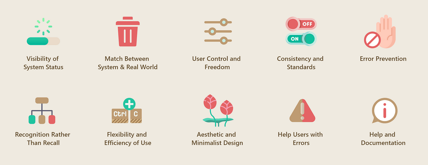
1. Visibility of System Status
The system should always keep users informed about what is going on through appropriate feedback within a reasonable time. This means providing continuous updates as the user completes actions, ensuring they understand the system's state at all times, which reduces frustration and confusion. Such as error messages, form steps, loading indicators, and more.
2. Match Between System and the Real World
The design should speak the users’ language. Use concepts familiar to the user, follow real-world conventions, and display information in a logical and natural order. This heuristic emphasizes the importance of aligning the system with human expectations and experiences to make the interface intuitive.

3. User Control and Freedom
Users often choose system functions by mistake. They need a clearly marked 'emergency exit' to leave the unwanted state without having to go through an extended dialogue. Support undo and redo. This freedom empowers users and encourages exploration, knowing they can easily revert actions without penalty.
4. Consistency and Standards
Users should not have to wonder whether different words, situations, or actions mean the same thing. Follow platform and industry conventions to ensure consistency, which helps in building user confidence and reducing learning time.
5. Error Prevention
Even better than good error messages is a careful design that prevents a problem from occurring in the first place. Rather than focusing on error recovery, designing pathways that prevent errors from occurring is a more efficient use of resources and enhances user satisfaction. You can implement safeguards to prevent errors, such as confirmation dialogs before critical actions like deleting data.

6. Recognition Rather Than Recall
Minimize the user’s memory load by making objects, actions, and options visible. The user should not have to remember information from one part of the dialogue to another. Instructions for use of the system should be visible or easily retrievable whenever appropriate.
7. Flexibility and Efficiency of Use
Shortcuts and tools — unseen by the novice user — may often speed up the interaction for the expert user to such an extent that the system can cater to both inexperienced and experienced users. Allow users to tailor frequent actions, which enhances the usability of the system.
8. Aesthetic and Minimalist Design
Aim for a clean and minimalist design, incorporating only essential elements to minimize cognitive load and visual clutter. Every extra unit of information in a dialogue competes with the relevant units of information and diminishes their relative visibility.
9. Help Users Recognize, Diagnose, and Recover from Errors
Error messages should be expressed in plain language (no codes), precisely indicate the problem, and constructively suggest a solution. Providing clear and helpful error messages enhances user experience by reducing frustration associated with troubleshooting.
10. Help and Documentation
It is better if the system can be used without documentation, but it may be necessary to provide help and support. Any such information should be easy to search, focused on the user's task, list concrete steps to be carried out, and not be too large.
Conclusion Jacob Nielsen's heuristics are not just rules but guiding principles that can significantly enhance the effectiveness and accessibility of a user interface. By understanding and applying these principles, UX designers can create more intuitive and engaging interfaces that meet the needs of a broad user base.
Recent Posts

Mar 12, 2025
How to choose the right mobile app dev agency
Struggling to choose the right mobile app dev agency? Learn how to define goals, evaluate expertise, and balance cost vs. quality for a successful app!

Oct 07, 2024
Github Flow Branching Strategy
A complete and easy to use branching strategy. In this post we will go through its details and how to apply it in your repositories.

Oct 02, 2024
Git Branching Strategies
Different branching strategies and how they can help with your Git branch management, as well as your test and release pipelines.